GROWING HOPE
URBAN FARMS
Redesigning how a community finds food, from four outdated guides to one living resource map.
ROLE
UX Designer
TEAM
Sureet Sarau
Emily Veguilla
Grace Ho
TIMELINE
September 2023 - December 2024
SKILLS
UX Research
UI Design
TOOLS
Figma
Google Suite
Miro
Qualtrics
Overview
Growing Hope Urban Farms, is a nonprofit organization based in Ypsilanti, MI, working to reach food sovereignty within their community. One of the ways Growing Hope works to reach this mission is through their resource guides.
Resource guides serve are primary interface for the community to find programs and information. Currently, there are 4 different versions of the guides that are supposed to be a way for the organization to align users to the goal of food sovereignty and equitability.
These guides are out of date, hard to locate for users, and difficult for employees to update from the backend.
Project Goals
🥕 Create a new resource guide that users can easily access and comprehend 1
🥕 Merge information from the 3 various versions currently available
🥕 Have a new resource guide that is easy to update from the backend
🥕 Incorporate Growing Hope’s network of 500+ home growers into the new solution
🥕 Ensure the map is accessible across multiple devices and platforms– mobile, desktop, and printable version
Research
Competitive Analysis
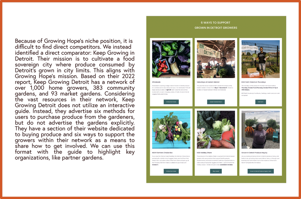
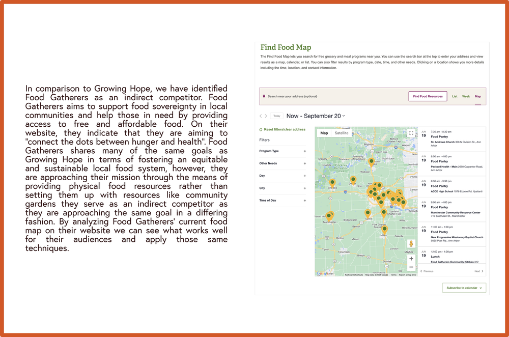
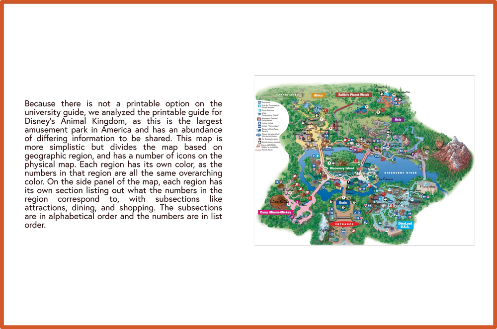
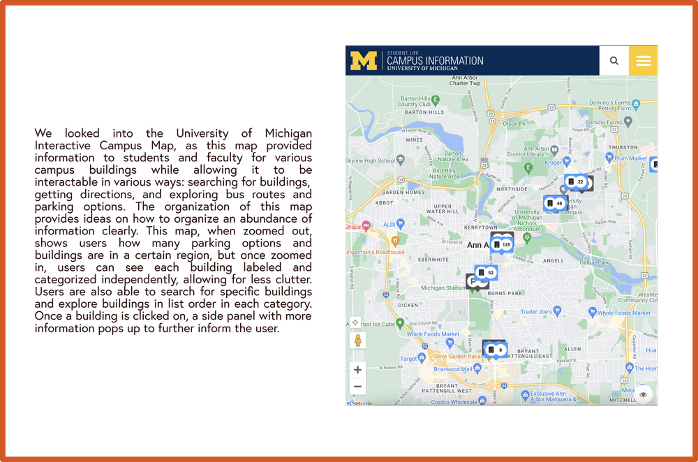
To get a better feel of the problem space, our team started exploring potential solutions for this project by taking a look at direct and indirect comparators to better contextualize how organizations, in similar and different fields, resolve similar issues
Direct Comparators
Indirect Comparators
Heuristic Evaluation
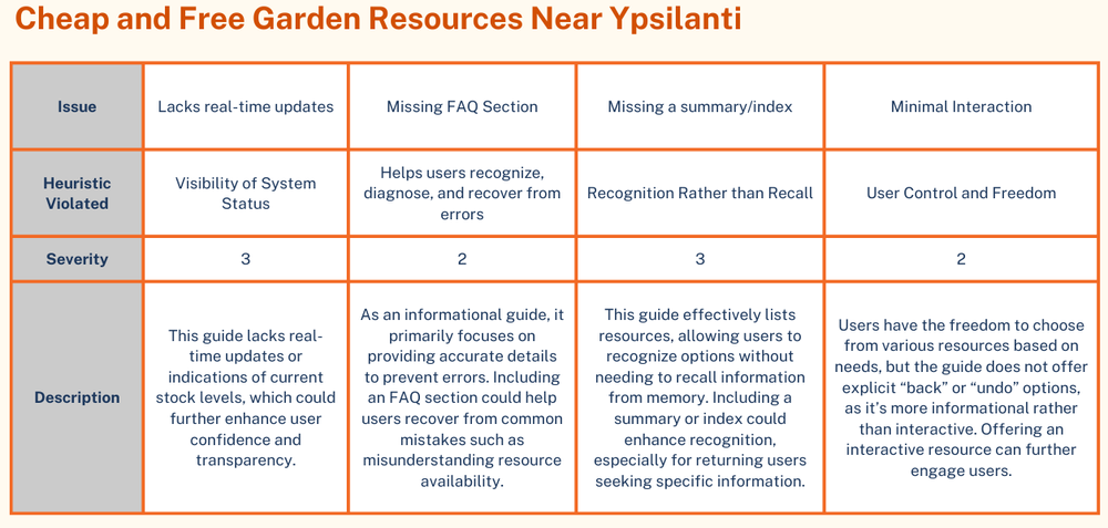
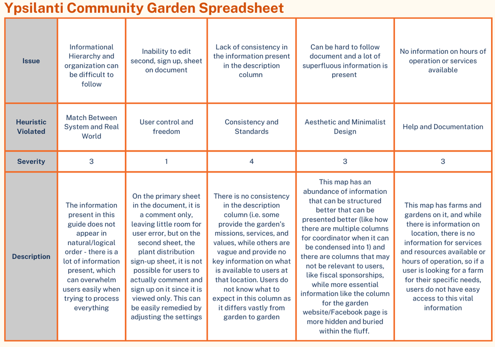
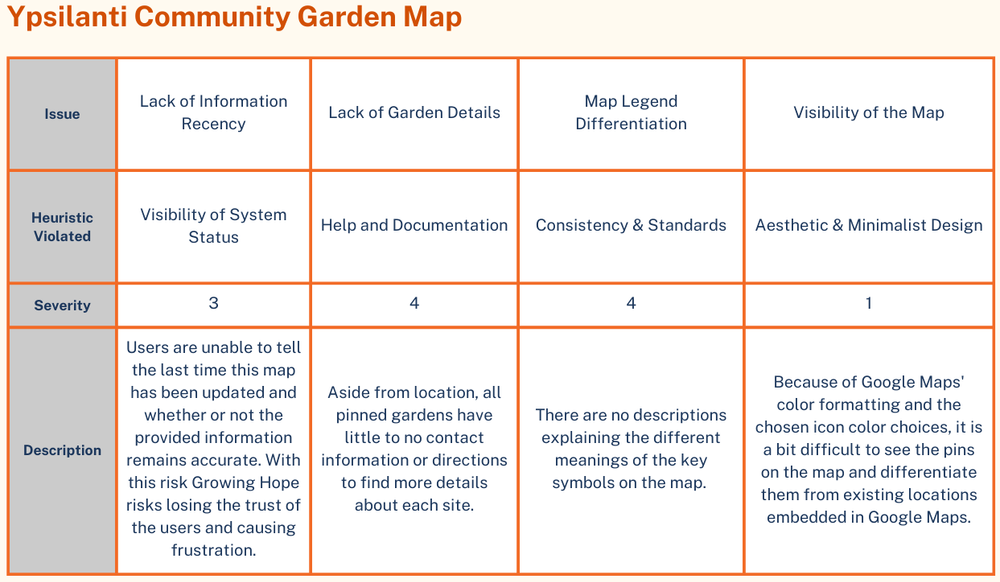
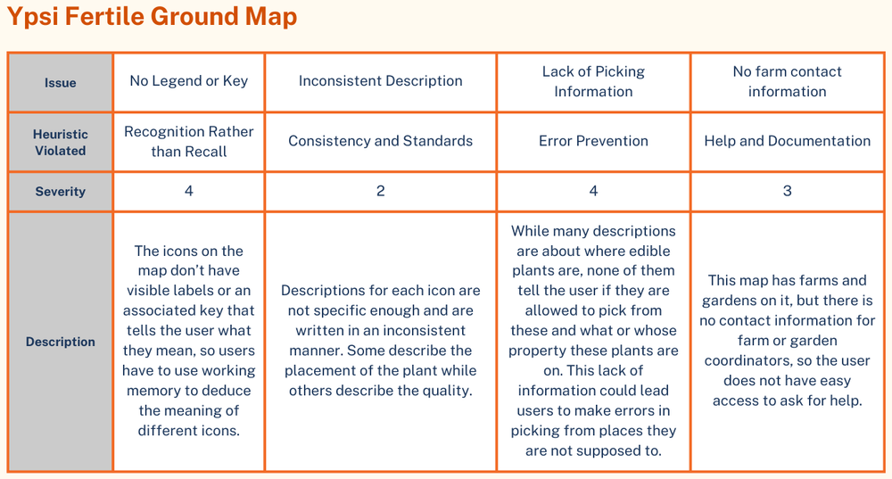
As a means to understand the current user experience with the current state of the project, the team conducted a heuristic evaluation of the 4 versions of the resource maps and guides currently available to users. We utilized Jakob Nielsen’s 10 principles for interaction design to assess the guides with a severity scale for issues from 1 to 4, where 1 is less critical and 4 is more critical.
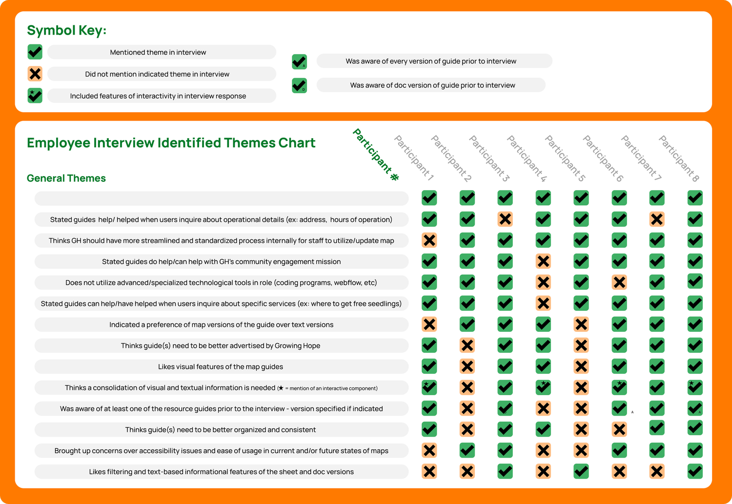
To gain perspective on employee experiences with the resource guides, our team conducted 7 interviews.
While many of them do not interact with this resource, they provided key information that helped guide our next steps.
The responses from the staff at Growing Hope highlighted common themes and areas of interest.
Employee Interviews
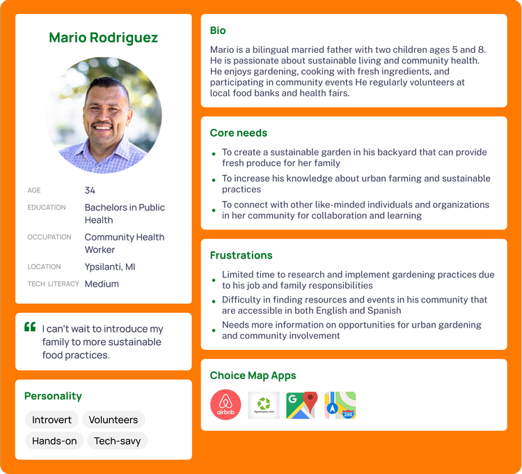
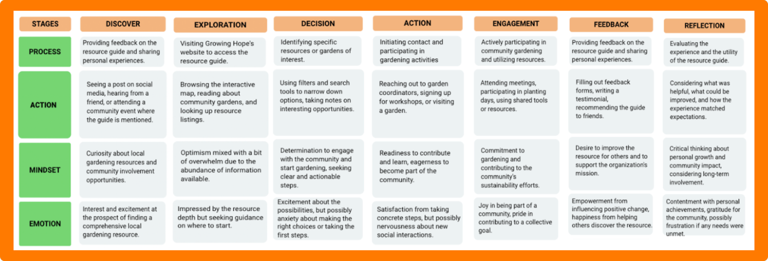
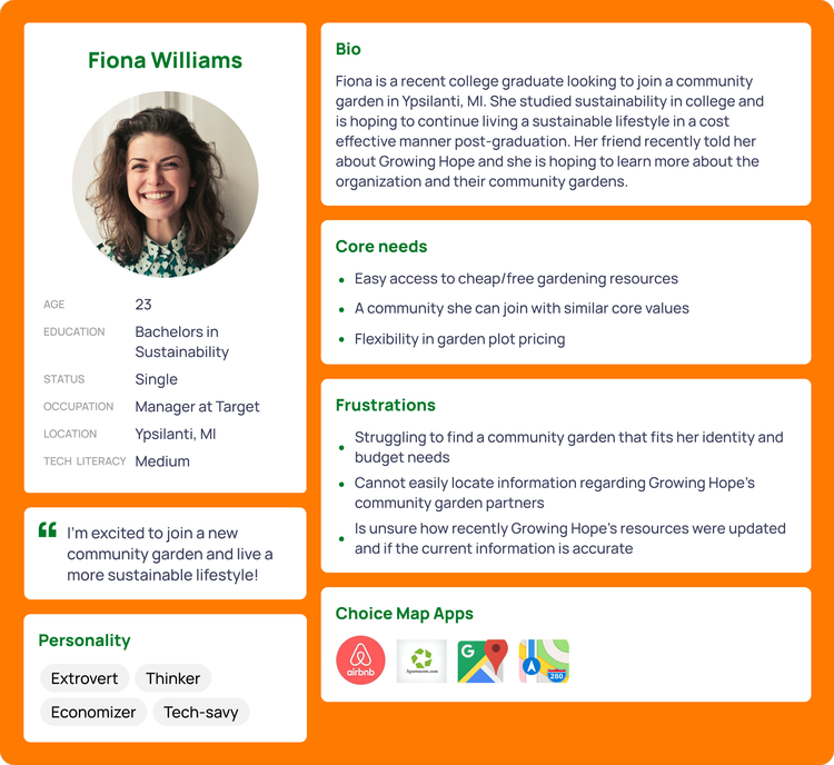
User Personas & Journey Maps
Themes & Insights
When looking at the insights from each research method holistically, we found common themes in both organizational and user needs. We also were able to pinpoint the key themes each stakeholder group indicated regarding needs.
Usability Challenges
The interviews, surveys, and heuristic evaluations identified usability challenges including navigation difficulties, inconsistent information architecture, and lack of visual cues. These findings underscored the importance of enhancing user experience and interface design. A few survey responses also indicated a need for accessibility and inclusion.
Alignment with Organizational Goals
The insights gathered from interviews and heuristic evaluations underscored the importance of aligning the resource guide with Growing Hope's mission and objectives. By addressing usability issues and improving content relevance, the revised resource guide can better support the organization's goals of promoting food sovereignty and equitability.
Clarity & Access of Information
Currently, there are inconsistencies internally and externally when it comes to the research guides’ visibility and presentation of information. It is essential to ensure the guide is found in a clear place for both users and employees and that the information is relevant and consistent across platforms, as users face varying difficulties seeking out the guides based on methodology.
Design
Iterations
Tap through to watch our designs come to life from sketches to high fidelity prototypes!
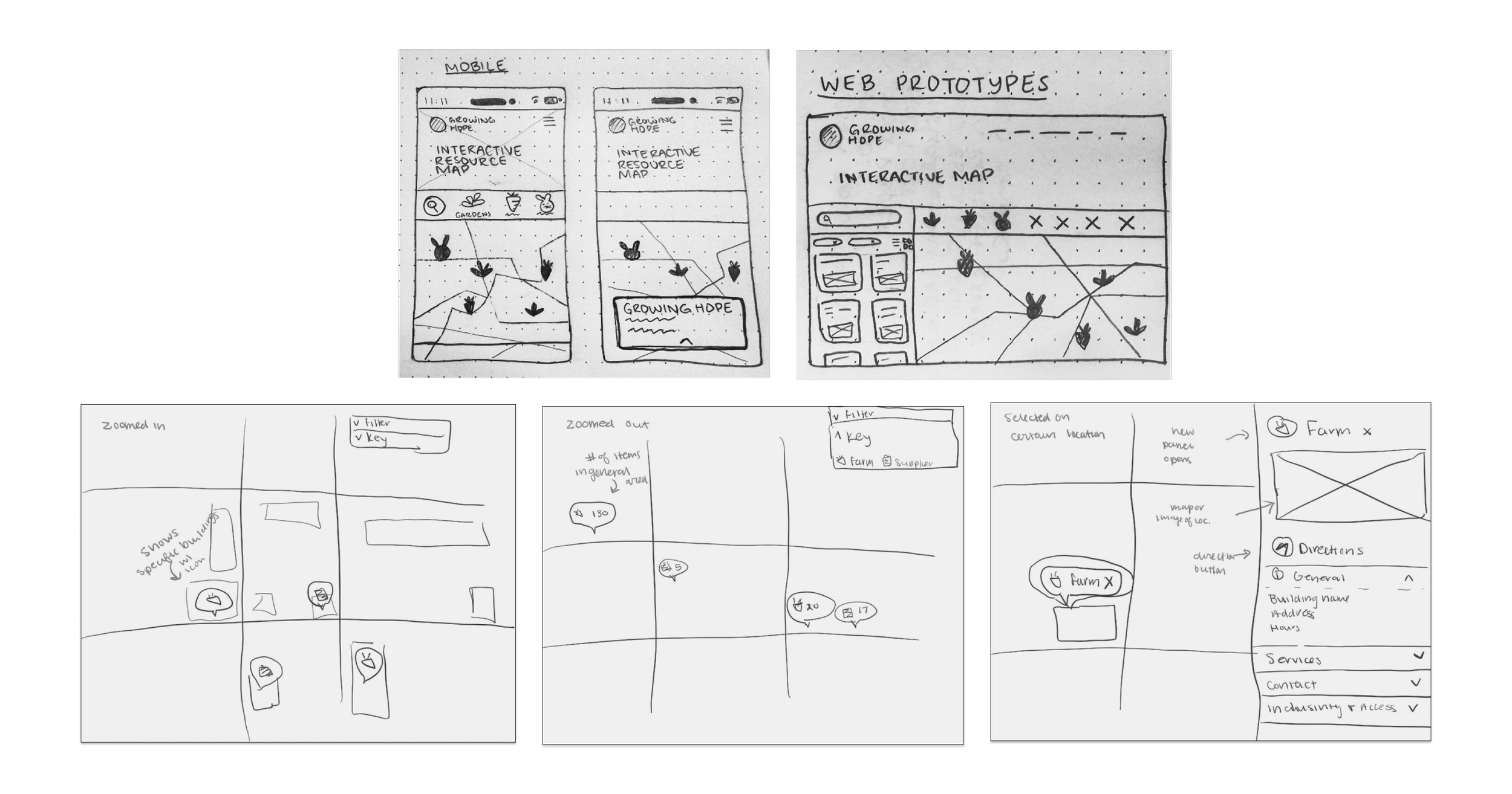
Sketches
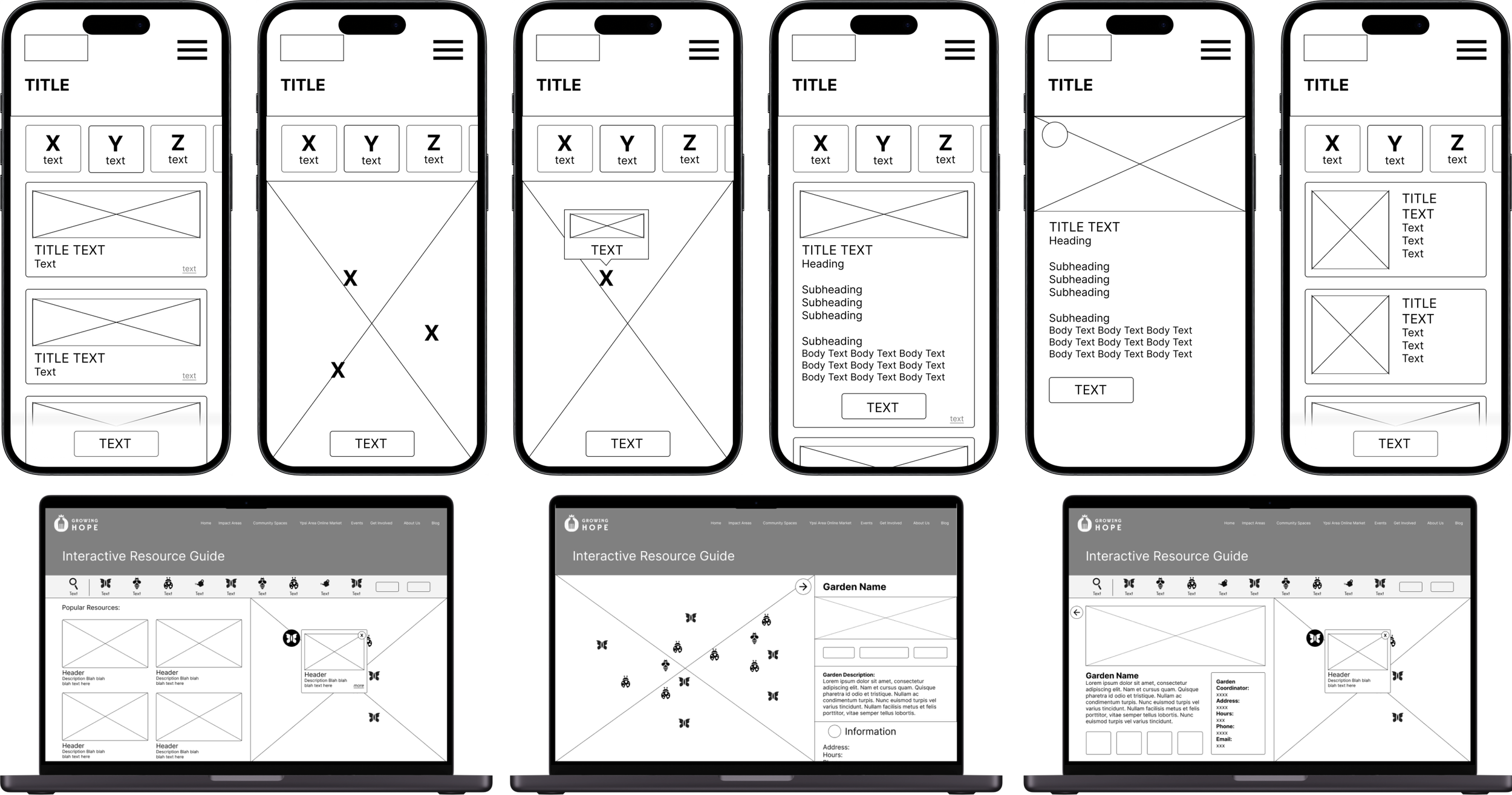
Low Fidelity
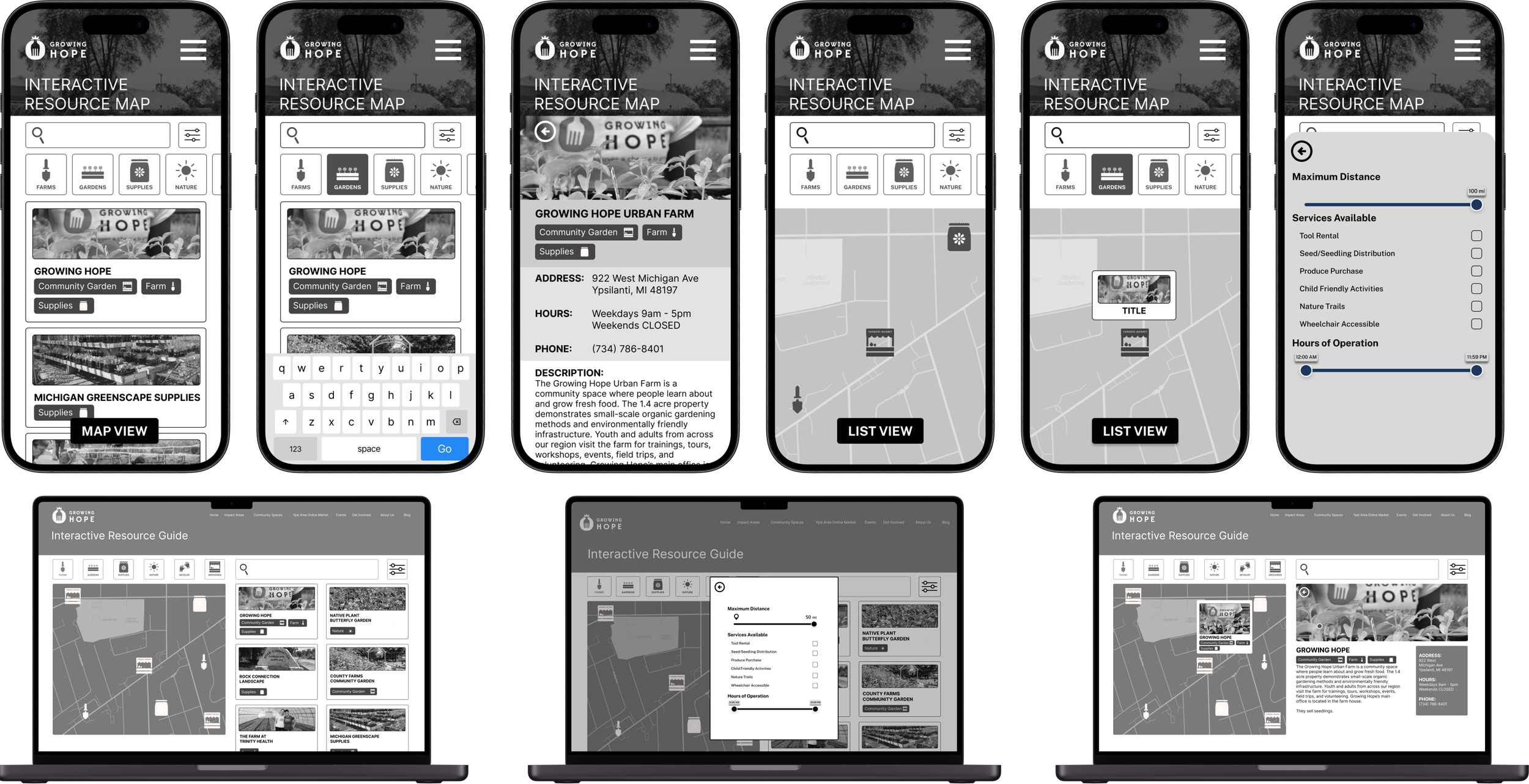
Mid Fidelity
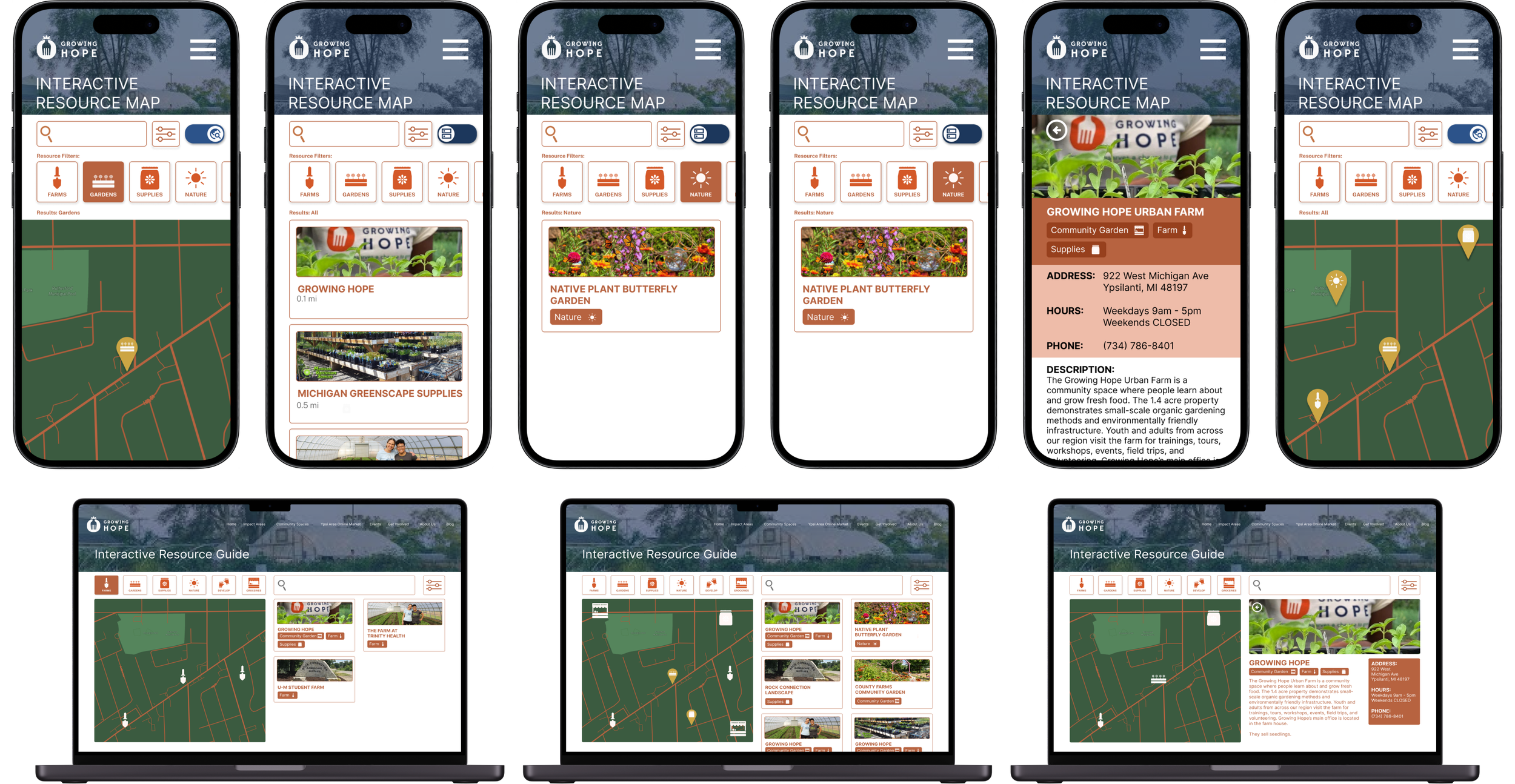
High Fidelity
Usability Testing
Our final designs could not come to life without multiple rounds of usability testing. Based on peer feedback, expert critiques, and the results of our user testing, in our final iteration, we made decisions to alter aspects of our product’s architecture to better improve the user experience. The following changes, with the rationale for the change, were made:
-
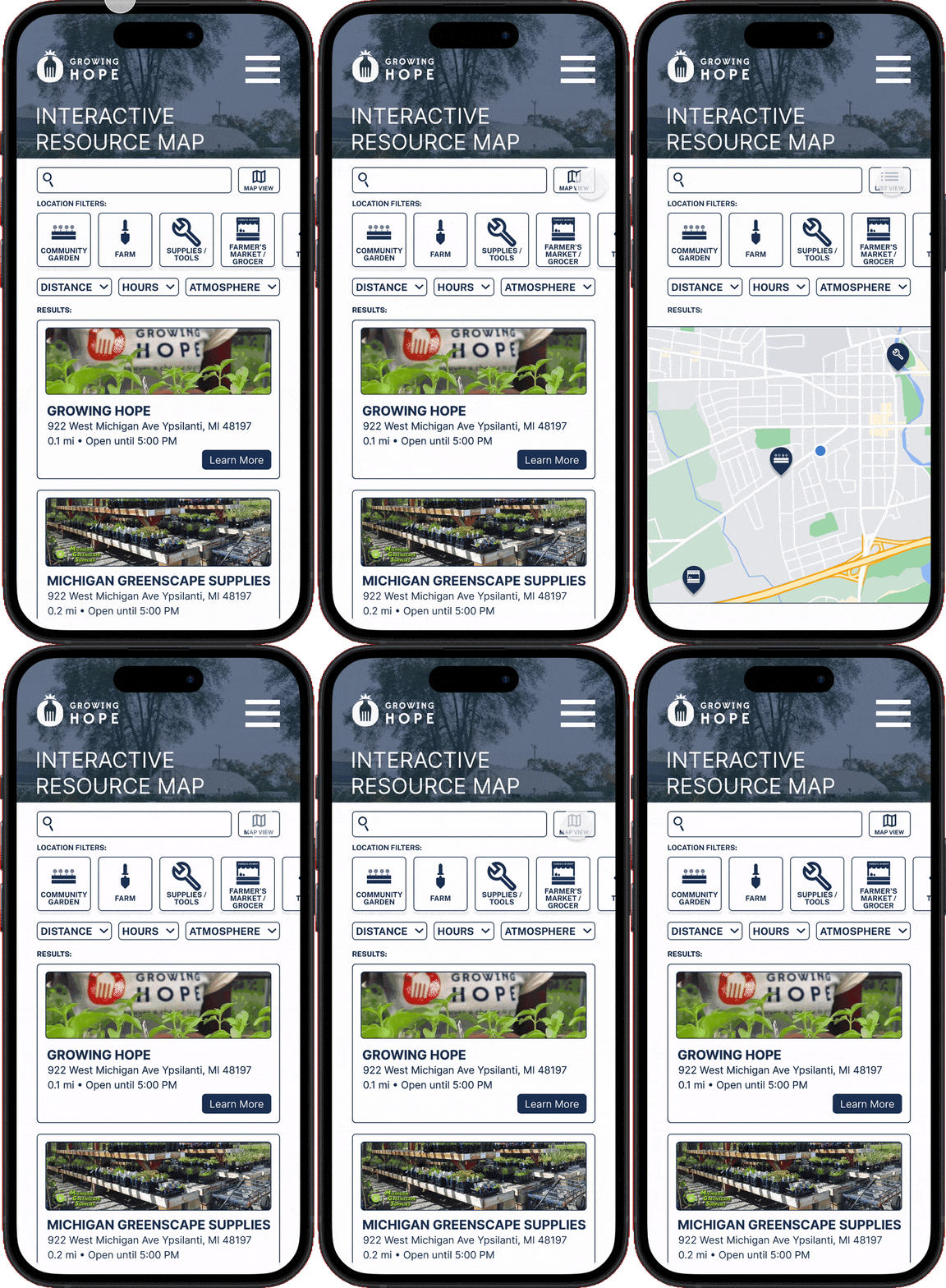
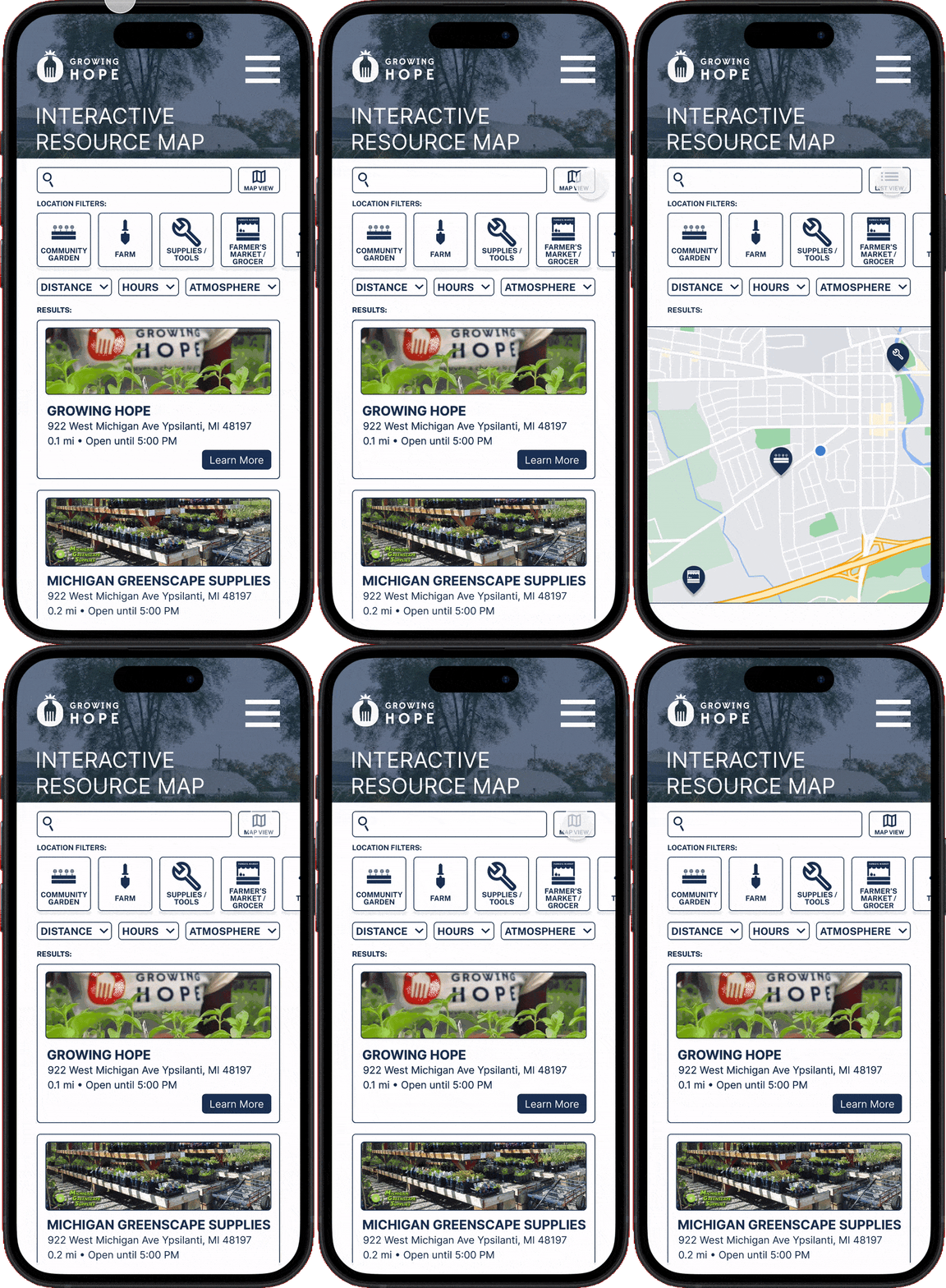
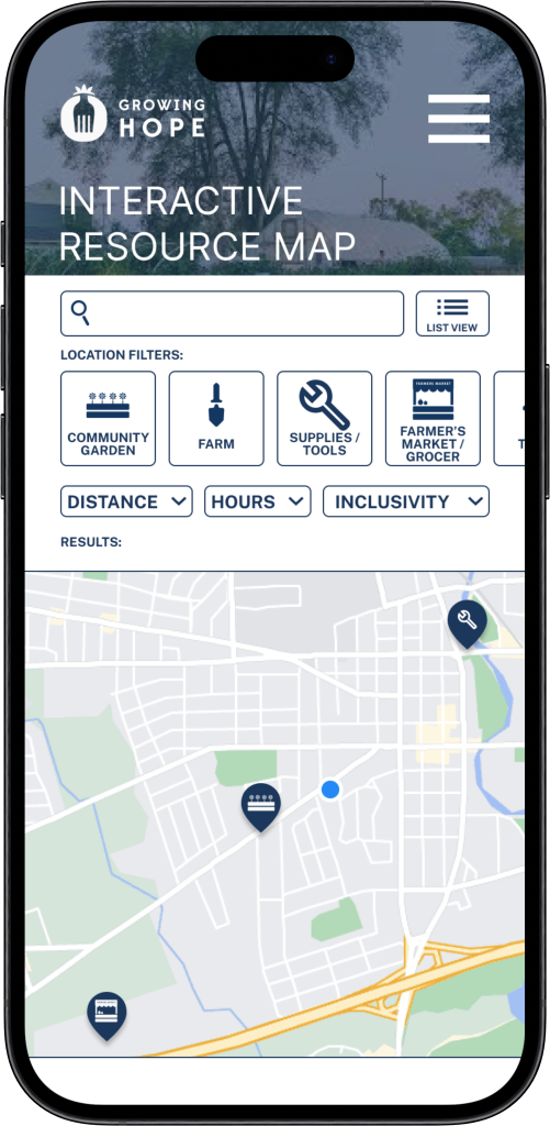
After consulting with Jim Rampton, a professional UX designer and professor at U-M, and our peers for feedback, both parties explained that the map view/list view button at the bottom of the screen seemed hidden and obtrusive. To remedy this, the team decided to change this button into a toggle switch with a map and list icon and move it to the header tab, next to the search bar. This way, the list and map view option is highlighted at the header alongside the other primary features and do not obstruct any cards or icons on the list and map, respectively. The visibility of this feature has now increased.
-
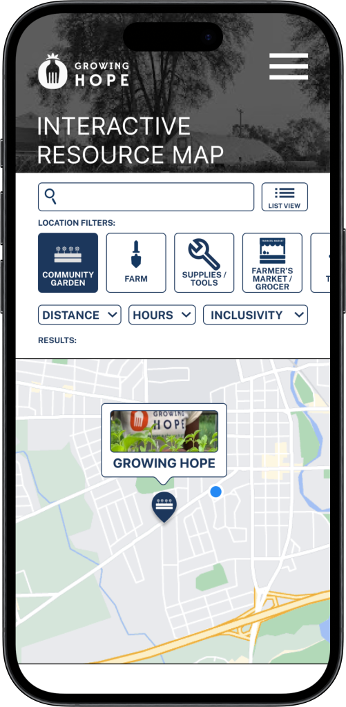
Based on user test results, the previous map icons that were based on location symbols seemed randomly placed and did not indicate an exact location on the map to users. Many users also did not think that they were clickable to expand and show more detailed location information. To remedy this and follow the consistency and standards heuristic, we have decided to adopt the generic pins that users will be able to recognize from any other apps or websites, such as Google Maps.
-
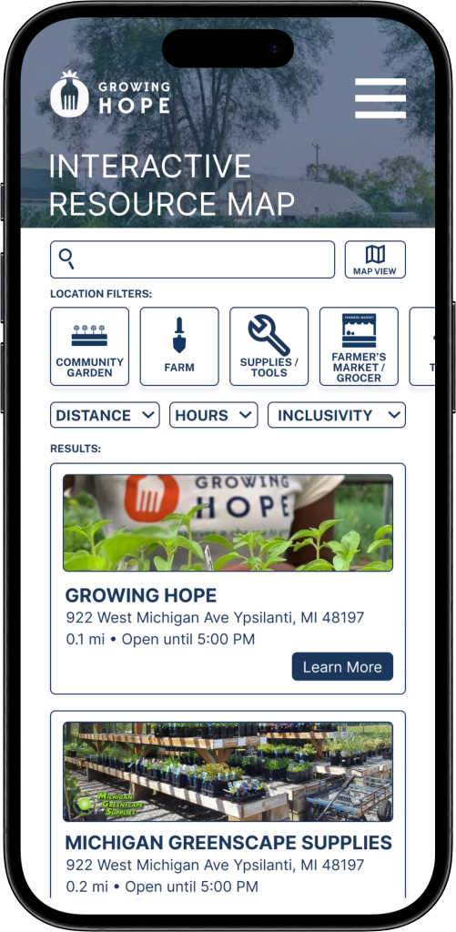
A common pattern we noted during the usability tests was that users mistook the location-type tags in the list-view location cards as clickable buttons. The team wanted to find methods to remedy this issue, as it was quite a common occurrence. During our peer reviews, an essential piece of feedback we received was that the location-type tags seemed redundant considering the filters above; if someone filtered for farms, they don’t need a symbol on the location cards to indicate farms. They suggested keeping tags in the longer-description pages of locations, but not in the default list-view page. By getting rid of these tags in the default list view page, we prevent potential errors while resolving the issue of redundancy.
-
Both usability testing and in-class feedback demonstrated that our design created confusion, as users were unable to decipher the differences between ‘location type’ and ‘services available’ filters. We decided to combine these 2 filters into one broader ‘location’ filter that encompasses both aspects of the location. The team decided it would be best to combine the two filters into one, ‘location filter,’ to improve clarity for users.
-
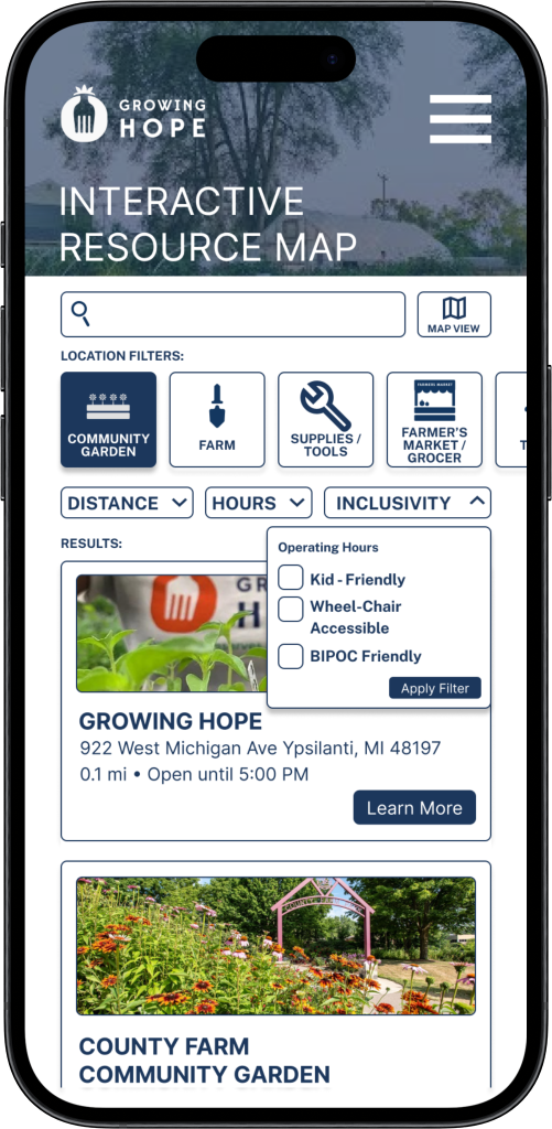
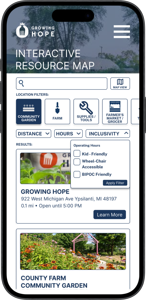
To also improve clarity and showcase that these are clickable buttons and not just aesthetic symbols to users, the team added a subtitle indicating ‘location filters’ above the primary location-type filters. Usability test results indicated that several users were unaware that the filters in the header were buttons/filters, and assumed that the buttons were designs that were added for aesthetics and had no functionality. In our mid-fidelity design, we had an advanced search option that had service filters such as “Wheelchair accessible” in a separate location from the ‘location filters,’ but our usability tests showed that users experienced confusion by having multiple filters in multiple places. By relocating the advanced search options to drop-down menus right beneath the location filters, the user is able to see all the filtering options in one place and apply them all at once without any unnecessary clicks or menus.
-
Usability testing showcased that many users either were unable to find the advanced filter button or were confused as to why there were primary and secondary filters, not understanding the hierarchical difference between the location type filter in the header and the advanced filters. Considering the abundance of confusion we received in regards to these filters, we decided to increase visibility and add these filters (distance, atmosphere, and hours of operation) to the header, underneath the location filters, as drop-down menu options. Since the secondary filters are located alongside the primary location filters, we hope that this design choice will significantly reduce the confusion that users initially had when accessing and utilizing these filters. ion
-
Our team decided to make this change because Dark blue as the primary color in this design makes information appear more legible when compared to the orange from the previous design Iteration. We did not have much flexibility when choosing the color scheme, font, or symbols within our designs, as we were following the brand style guide that our client provided us with. However, we found that the dark blue color in the brand guide is better at conveying text information on a white background than the orange color on the style guide. This is vital for ensuring good color contrast ratios for accessibility purposes.
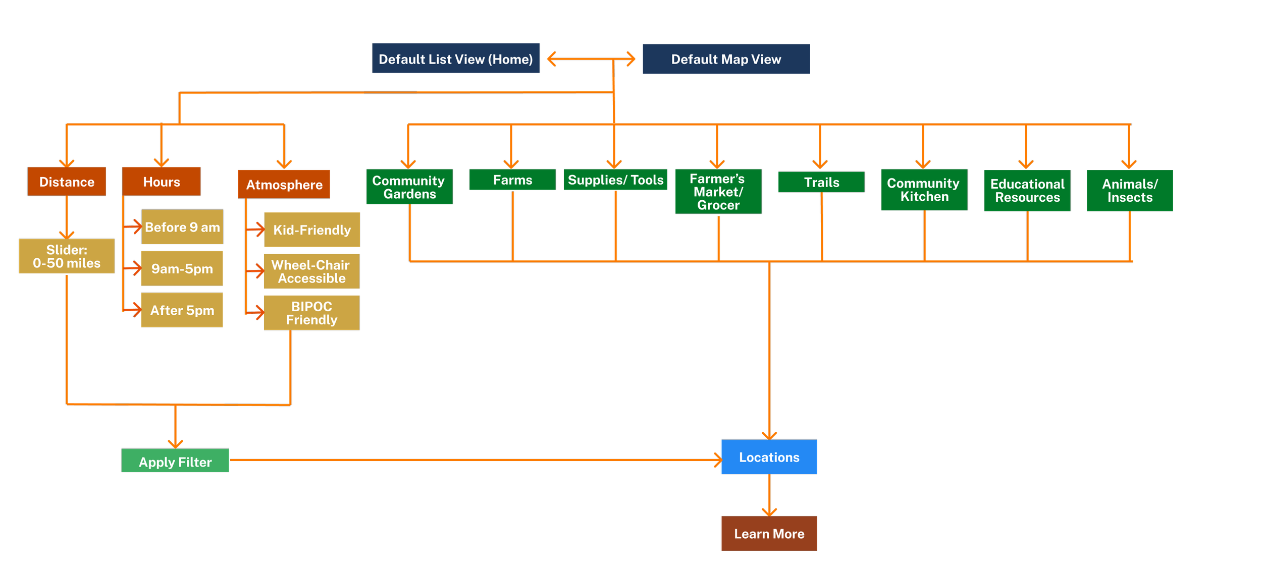
User Interaction Flows Map
FINAL KEY FEATURES—
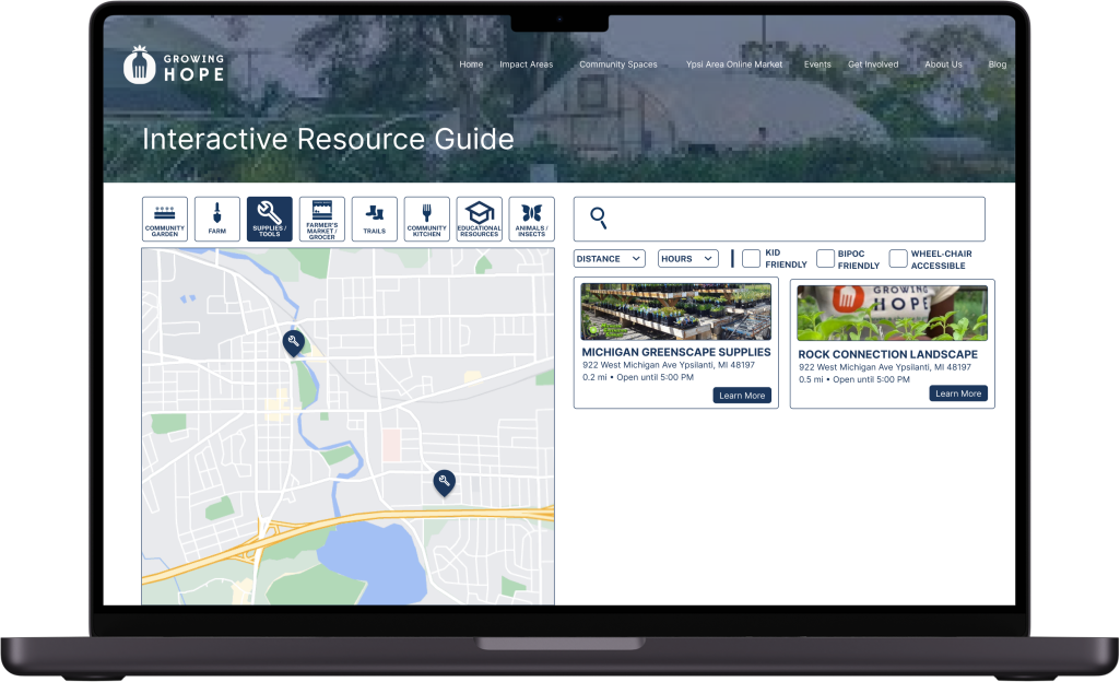
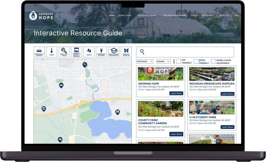
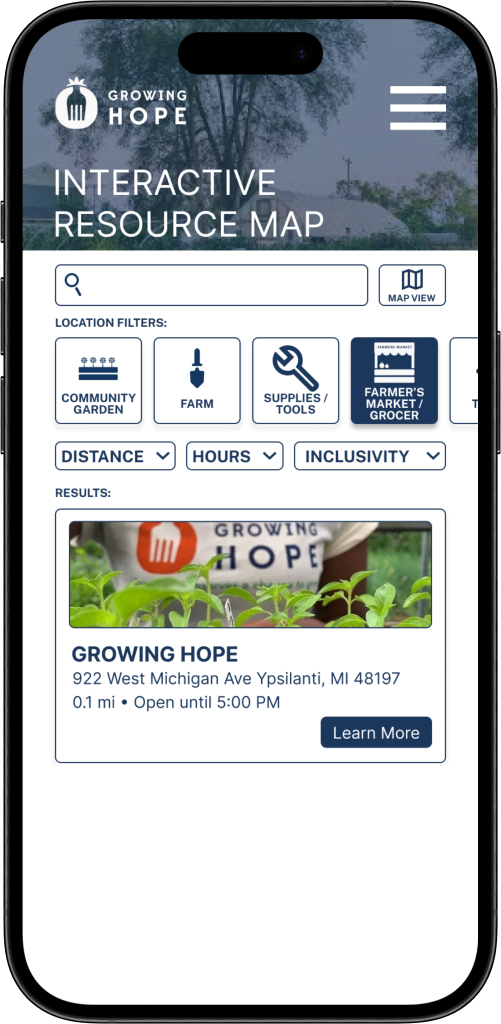
Allows users to easily see all resources in the format that works best for them
Clear icon and text label on the button
1. TOGGLE BETWEEN MAP AND LIST VIEW
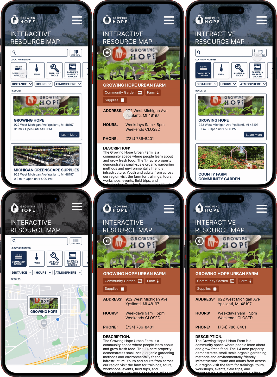
2. INCREASED FILTRATION
Expanded filters to support differing user needs
Unique iconography to represent different location types
Advanced filters to support things like distance, hours, and overall atmosphere
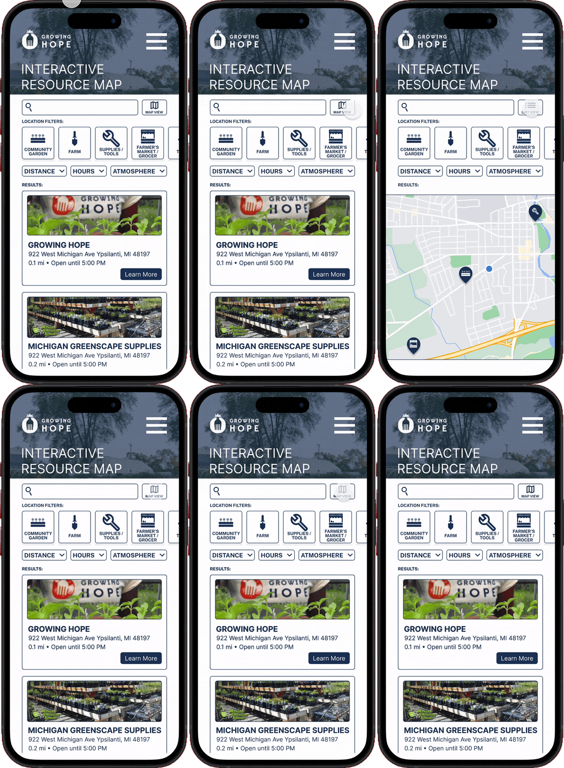
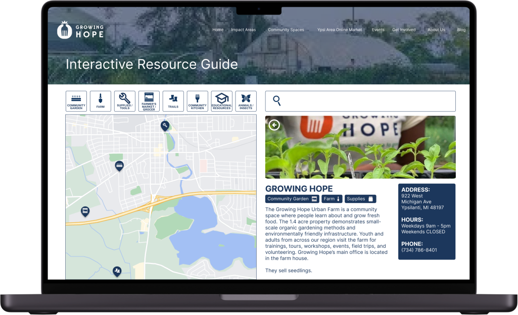
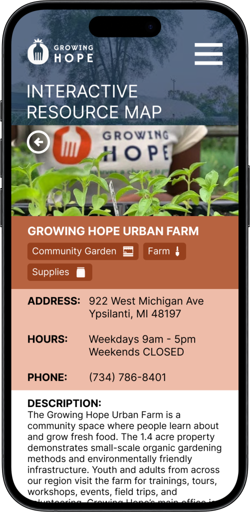
3. BRAND NEW RESOURCE PAGES
Pages designed specifically for each resource
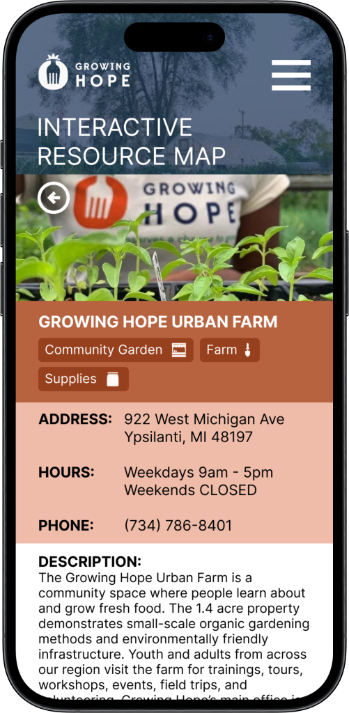
Highlights users’ most searched information, such as address, hours, and contact information
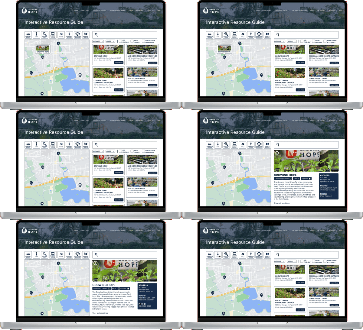
FULL PROTOTYPE
BEYOND THE DESIGNS
⋆
BEYOND THE DESIGNS ⋆
This project was brought to life at the University of Michigan - School of Information for my User Experience Design Capstone course.
Throughout this course we worked with Growing Hope over the course of 8 months and truly see the impact design can have in the lives of others. At the end of our 8 months of work my team and I presented our research and designs at the 2024 UMSI Project Exposition in April 2024.
Based on our work during the capstone, we were able to extend our capstone and continue to work with Growing Hope beyond the scope of our coursework to make these designs come to life.
You can view the live resource map here!!
You can view local coverage about the resource map, its impact, and its relation to Growing Hope’s mission here!!
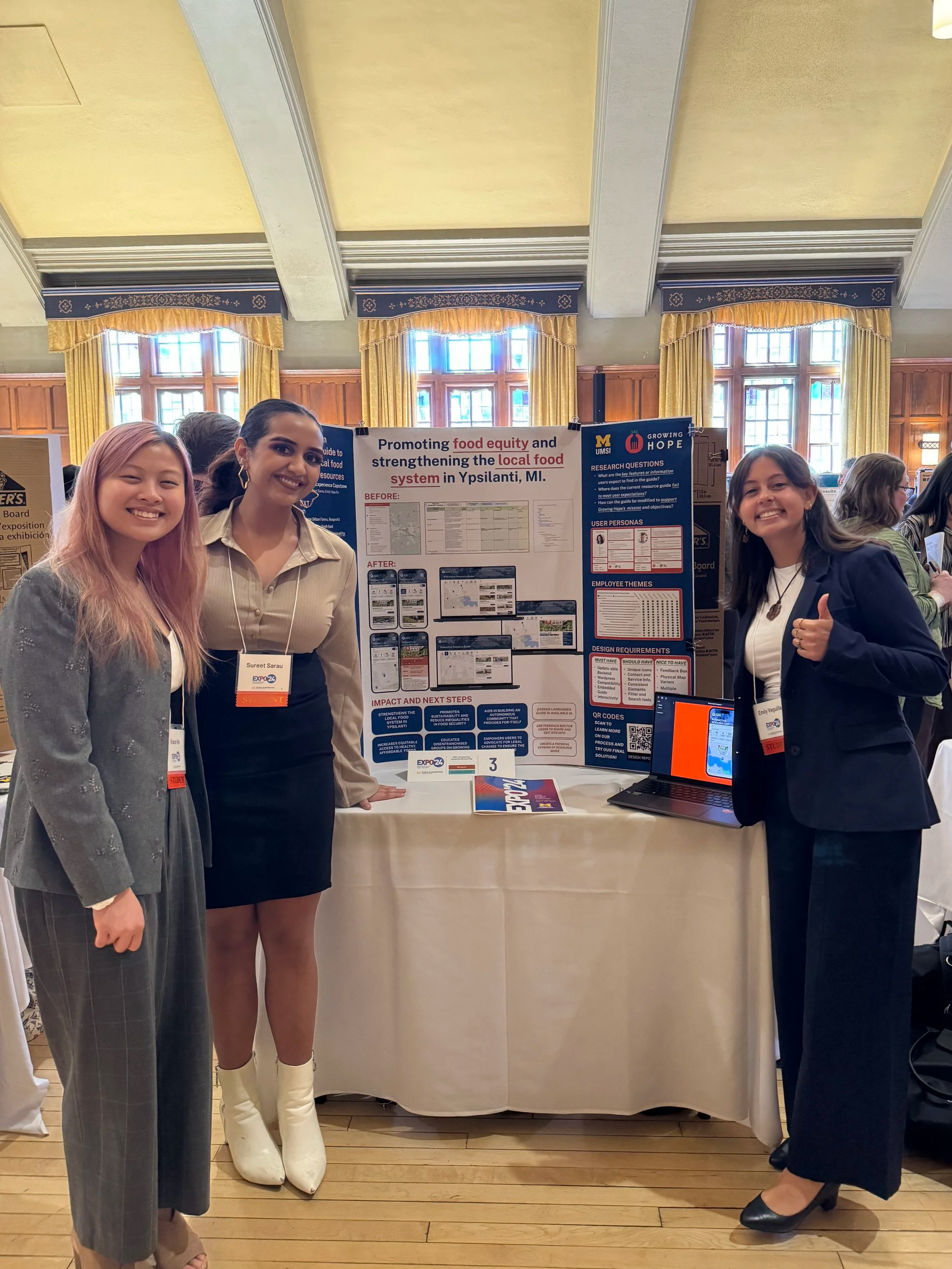
Me and the team at 2024 Exposition, sharing our work on this project :)